So many people request reviews from us for their dropshipping stores. So we decided to officially start our Roasts & Ranks series to do just that. In addition to reviewing dropshipping stores, we’re also using this series to rank them based on their performance.
Do you want to submit your own store and feature in our Roasts & Ranks series? You can do so by sending an email with the subject line “Roasts & Ranks Store” to Peter Pru at [email protected]. You’ll have the chance to make it into this series with a thorough review. On top of a review that explores what you’re doing right and what could benefit from improvement, you’ll also get $100 sent to your PayPal account if we choose to review and rank your store, regardless of performance.
How Roasts & Ranks Works
For each Roasts & Ranks review, we’ll be looking at four main categories to gauge how well a store is doing:
- First Impressions — How people will react upon first encountering the business
- The Niche — The types of products and categories the store sells
- The Offer — What differentiates the store from others and value to consumers
- The Funnel/Store — How the store collects assets and drives sales
Based on each store’s performance in these four categories, we’ll be giving an overall score from one to ten, with ten being the best.
The first store we’re going to be looking at here in the Roasts & Ranks series is What Feels Right, at whatfeelsright.com.
First Impressions From What Feels Right
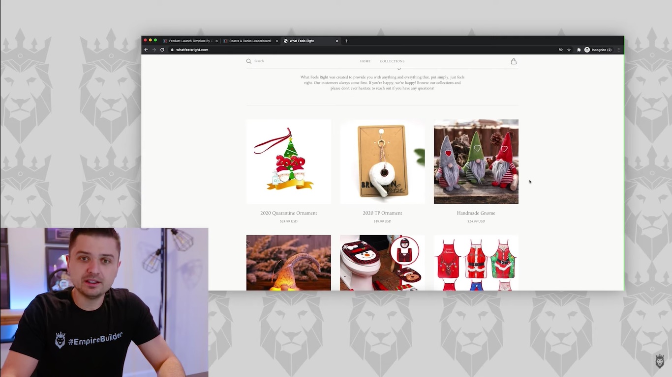
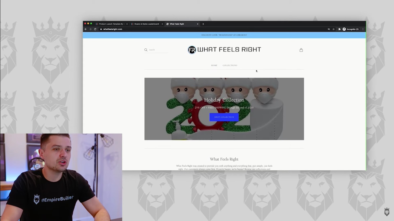
After visiting their website for the first time, we didn’t feel that it left a good first impression. The biggest issue we had with the site was that it seemed too broad in its product scope. While certain items had a Christmas vibe to them for the holidays, such as Christmas decorations and tree ornaments, there were categories such as “Pet Collection” and “Household Collection” below that made the core category a bit too unclear.
In short, we felt that this website gave off the vibe of a generic Shopify store with nothing that really made it stand out. We believe that this store could have given a better first impression if it had a specific focus. For example, it could’ve featured a holiday-themed background and highlighted holiday-themed items toward the top of the homepage that would have spoken to a specific audience. As it stood at the time of this review, the store seemed too general and unfocused to appeal to a specific type of shopper.
We Couldn’t Nail Down a Specific Niche
The main reason behind our negative first impression was the lack of a specific, focused niche that we could identify. The site seemed all over the place in terms of inventory. It had a mix of Christmas-themed products and ornaments with the seemingly random pets and household categories below. There just didn’t appear to be a coherent structure to the store. Instead, it offered a random selection in an attempt to appeal to anyone.
We definitely felt that this store needed to stick with a particular niche. This could have worked well with the Christmas theme. For instance, they could have sold a humorous 2020 Quarantine Ornament, which was a 2020-themed ornament that referenced the pandemic featuring two characters with masks and a bottle of hand sanitizer in front of a Christmas tree. It could make for a light, funny novelty gift that could be one of their bestsellers. In addition, people could personalize it to make it their own when buying it, which added even more appeal.
Instead of a singular focus, the site opts for creating a section around Christmas ornaments. It also had subcategories that feature a variety of unrelated products ranging from pet feeders and pet hair removers to towel holders and night light projectors. It has the overall vibe of a site that’s throwing everything at the wall to see what sticks. This prevents it from having any clear identity.
An Offer That’s Equally Unclear

When it comes to the value that What Feels Right offers, that was also too vague. Sure, the 2020 Quarantine Ornament is a fun-looking product. It also had a multitude of customer reviews with high star ratings and positive comments. Still, we saw no images of the product in use. There was also a lack of images in the store itself featuring the item in use. We didn’t see photos of it hanging on a Christmas tree to show its size and how it looks in a real-world setting.
We always recommend that people show their products being used to demonstrate how they look and function once purchased. It’s an integral feature of a winning offer that further confirms the value the product brings. Otherwise, people are going on empty text reviews and blind faith that the product will be as good as the seller claims it is.
We were impressed with some of the specific products sold on What Feels Right. But there were ways we felt they could build on them with a richer ecommerce experience.
A Store That Feels Generally Incomplete

There’s a good chance What Feels Right sold a good number of Christmas ornaments and other similarly-themed products during Q4. However, we’re always wary about focusing on seasonal products, particularly when that’s the store’s primary focus. There are plenty of other products in the store that aren’t seasonal. But they’re too random to categorize collectively and focus on.
Another issue we had with the store as a whole was its lack of navigation and overall features. We didn’t see a link in the top navigation to any kind of contact page or specific categories. We also saw no guarantees on the homepage or much else to get people engaged beyond a couple of social media links in the footer.
The website reflected a common issue we’ve noticed with many ecommerce sites. They spend too much time and effort on adding and pushing new products. The governing attitude here is that they’re one product away from a breakthrough. But the fact is that they’re one niche away. It’s not about maximizing the number of products in your inventory to connect with everyone. It’s almost exclusively about focusing on one core niche that builds a loyal following of customers within a specific audience.
There was also a distinct lack of a sales funnel on What Feels Right. Although many ecommerce business owners don’t think they have a sales funnel, the fact is that they do have one. But it’s not always efficient or developed. They rely on products to sell themselves with simple product pages. Also, there’s just a basic shopping cart that leads people to a sale.
Our Overall Rating: 4.2/10
We feel that — with What Feels Right’s current platform at the time of this review — the store deserves a 4.2 rating from Roasts & Ranks. We saw that there was a degree of effort invested in putting this store together. It had plenty of potential to become a winning ecommerce business. At the same time, there was a lack of focus regarding products and niches. Also, the structure of the site seemed lacking and undeveloped. The website also lacked an effective sales funnel, which could go a long way in driving sales and optimizing the buying process. Again, with more focus on a specific niche such as holiday-themed products and a more developed store overall, this site has the chance to thrive.
Consult With the Experts

If you want to find out more about how you can build a successful ecommerce business with a highly developed website and efficient sales funnels, reserve your seat at our free ecommerce masterclass. You can also find more insights and Roasts & Ranks reviews of ecommerce sites on my YouTube channel.

