How to Make Money With ClickFunnels and Shopify in 2021

At Ecommerce Empire Builders, we’ve developed a series called Roasts and Ranks. Here, we rank ecommerce businesses from one to ten based on a number of factors. Watching can help you learn more about how to make money with ClickFunnels by learning from others’ mistakes and strategic wins. When ranking, we’ll look at four key factors, including:

  • First impressions
  • The niche
  • The funnel
  • The offer

Do you want to get involved and submit your online store for us to check out and review? Then you can submit your store to us online, and we may feature you in a future episode. 

In this edition of Roasts and Ranks, we’re looking at a business called Fitnetic Nation. We wanted to see what they’re doing right and what could benefit from some improvement. In the process, we’ll go over how to make money with ClickFunnels and Shopify.

First Impressions: An Impressive Use of Sales Funnels But Weak Design and a Broad Niche

From the moment we visited the Fitnetic Nation website, we were impressed with the fact that they used a sales funnel through ClickFunnels. Usually, the stores we review consist solely of a Shopify store without any use of funnels. But the people behind Fitnetic Nation seem to have a good grasp of a sales funnel’s importance. Instead of simply building a Shopify store, Fitnetic Nation uses a system to bring people up the sales ladder and optimize their maximum cart value.

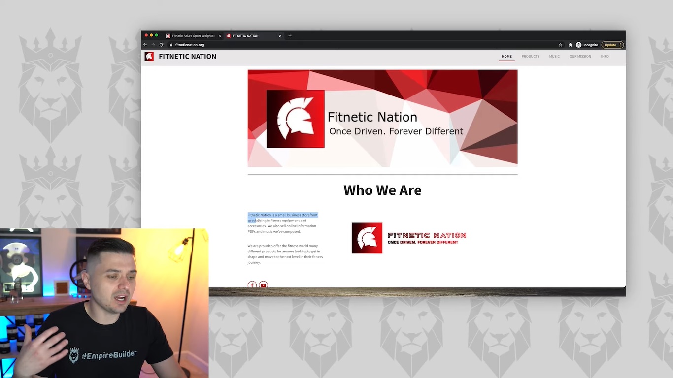
What was unique about Fitnetic Nation was that they had both a main website at fitneticnation.org and another ClickFunnels site, fitneticnation.com. Looking at their .org domain, we weren’t immediately wowed by the homepage. For a business in the fitness niche, we felt that the website was fairly generic and uninteresting. The banner image was somewhat blurry. We also noticed that the font in the banner logo was different from that in the logo below. We would’ve liked to see some consistency.

Problems With the Theme

Generally, we thought the theme on the .org domain was unimpressive. Even a basic WordPress or ClickFunnels theme could offer some more uniqueness and flair. The biggest issue with this is that a niche like fitness demands a lot of energy and liveliness to inspire prospective customers. But the website simply lacked that kind of energy. Due to the lack of clarity when it came to the niche on the homepage, we couldn’t give it many points.

For instance, the homepage on the .org domain states that Fitnetic Nation provides various products for “anyone looking to get in shape and move to the next level in their fitness journey,” but that’s too broad. We felt that they could have dug deeper here. They should have chosen a specific sub-niche, such as stay-at-home moms or busy professionals. It’s important to speak to a specific audience to establish a better connection, which Fitnetic Nation didn’t do.

As a side note, we don’t recommend getting into the fitness niche unless you’re willing to work hard and devote a lot of time to it. It’s one of the most competitive and influencer-driven niches. Unless you’re able to post on Instagram, YouTube, or other platforms on a daily basis, the chances of succeeding in this niche are normally very slim. A key part of knowing how to make money with ClickFunnels is knowing what niche (and sub-niche) to focus on.

The Store: Bare-Bones Product Pages Don’t Entice Buyers With a Clear Offer

Screen grab of Peter Pru analyzing Fitnetic Nation's product offer

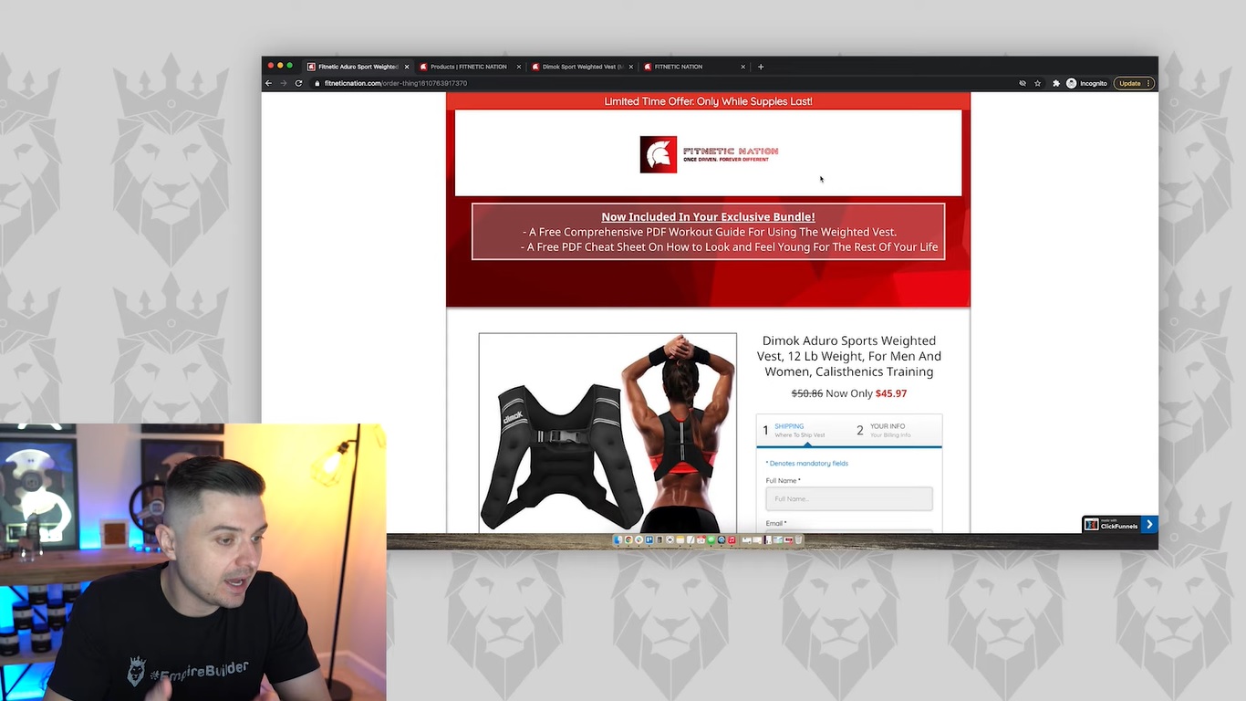
Looking at the products on Fitnetic Nation’s .org domain, we didn’t love the design of the product pages. The biggest problem was the absence of any kind of engaging offer. The price for the Dimok Sport Weighted Vest showed a sale lowering it from around $60 to $45.97. But there wasn’t anything attention-grabbing about the rest of the page. Also, the site didn’t prominently display the price. Even if people see the price drop, they may just head over to Amazon. They might find the product for even less there.

Whenever you sell a product through your business, you have to ask why anyone would buy your products. What is it that differentiates your brand from the many others out there? If you can provide a compelling answer to this question when launching your store, you’re that much closer to developing an exciting offer that drives sales.

An Unexpected Feature: The Music Tab

One unusual item that we noticed on the .org website was a tab in the main navigation labeled Music. When we opened that page, we unexpectedly found a single listenable track that we were able to load into iTunes. It essentially appeared to be a workout track that people could check out, which we thought was kind of cool.

In fact, we believe that could have been a great way for this brand to stand out. They can include a playlist of songs that inspire people to work out. What would make this a particularly effective selling point would be to include it for free with the purchase of other products. We let this count toward some points for Fitnetic Nation. But we think this would work better as a bundled product.

A Simple Mission Page That Needs Some Work

While it’s a good idea to include an “Our Mission” page, we found Fitnetic Nation’s to be empty and devoid of personality. The mission statement at the top of the page was simple and synonymous with many other fitness companies’ mission statements. And while the page mentions the company’s devotion to top-quality products and craftsmanship, there were no pictures or other accompanying text to establish the differentiating factor.

The Importance of Standing Out

Screen grab of Peter Pru analyzing Fitnetic Nation's website

Overall, the most glaring issue we had with Fitnetic Nation’s .org and .com websites was the distinct lack of any kind of attempt to stand apart. With so many competitors in the fitness niche, showing what makes your products different is a key part of how to make money with ClickFunnels and Shopify. The few product images on the website were simple stock images that didn’t truly show products in action. Also, there were no customer testimonials to vouch for the site’s claims of providing products of exceptional quality.

Looking back at their .com ClickFunnels site, we did notice that Fitnetic Nation had included an offer at the top of the main page. The offer was strong (featuring two free PDFs that would come with an “exclusive bundle”). But it was below a banner image with a logo. To be more effective, the offer would benefit from being placed above the logo. Ultimately, the logo doesn’t even need to be in there, as businesses need to build themselves around logos. A logo doesn’t mean anything if the brand doesn’t have a reputation that people associate with that logo. 

Our Final Score: 4.1

Based on what Fitnetic Nation is doing with their site at the time of this review, we feel that a 4.1 is a fair rating for this store. Right off the bat, we liked the use of funnels. There was also the start of some good ideas, such as the mission statement and the music section. But there needs to be a lot more. There are plenty of winning starting ideas here, but they could benefit from some expansion.

While there’s an offer on the ClickFunnels site, it’s hurt by a logo that’s entirely unnecessary. It’s also important to highlight the true value of that offer. For those free PDFs, for example, Fitnetic Nation could list the prices that they would normally cost. Additionally, there needs to be a specific niche and target audience within the fitness niche. Selling to parents, professionals, or young aspiring athletes could lend a sense of identity to this brand and speak to a particular group. The overall design of the website could also benefit from a clearer identity and engaging visual themes.

Fitnetic Nation is off to a great start on how to make money with ClickFunnels. But there are many ways to improve this business and transform it into a seven-figure earner.

Consult With the Pros

Dropshipper learning more about how to make money with ClickFunnels

If you would like to submit your own store for review, feel free to send us your information today and get a personalized review that helps you learn how to make money with ClickFunnels. You can also learn more about how to make money with ClickFunnels and earn a full-time income with our free Ecommerce Empire Builders masterclass. To get started with your own store and harness the power of sales funnels, register for this free webinar today. You can also watch more of our Roast and Ranks series on my YouTube channel.

Tagged : / / / /

Roasts and Ranks: Develop Your Dropshipping Niche Like This $50k Sticker Store

In this episode of our series Roasts and Ranks, we’ll be reviewing an online sticker store to see what they’re doing right and what they could be doing better. This follows the same format as the rest of our series, which scores businesses on a scale of 1 to 10, from worst to best, based on how they perform in four different categories, including the dropshipping niche, offers, funnel, and traffic.

If you would like us to feature your business in our Roasts and Ranks series and gain access to the leaderboard, you can easily submit your funnel or store on our website. Regardless of how you perform, we’ll send you $100 to your PayPal if we review your business.

This particular store we looked at is a sticker store called Eagle Realm, which is run by one of our $50k Club students.

A Clearly Defined Dropshipping Niche

One of the most important things for any ecommerce store to have is a specific dropshipping niche that makes it clear what they’re about. Otherwise, people are likely to leave if they don’t connect with any particular dropshipping niche. Put simply, if you’re trying to appeal to everyone, you’ll ultimately be appealing to no one. Thankfully, Eagle Realm gets this right from the start with its target niche, which caters to a patriotic aesthetic that’s sure to attract a specific target market. 

The homepage has a header “Owned & Operated by American Patriots” over an American Flag banner. Combined with the list of flag-themed, best-selling products immediately below, we instantly know what Eagle Realm is all about. The site offers everything from American flag home decor to stickers, decals, and magnets sharing this consistent theme of national pride.

The Layout

Eagle Realm also sticks to a simple layout to avoid over-complicating anything, which is a good strategy. It prevents any confusion over navigation or too many steps. However, in addition to the basic “Home” and “Catalog” tabs at the top of the page, we’d recommend adding a “Contact Us” or “Track Your Order” page. 

To really express the value of this site, we’d also suggest creating something like an “Our Story” page. This could detail what inspired this site and its overall mission. Showing pictures of the first sales and how the site got started could add a personable “behind the scenes” touch that people love to see.

Oftentimes, people may not buy directly from the main website. They might instead use it to contact the store owner. That’s why we definitely feel that this store could benefit from adding a contact page of some kind with a tab in the top navigation.

When it comes to the dropshipping niche itself, Eagle Realm very clearly earns a 10. The business knows its target audience.

A Strong Offer That Emphasizes Value

Screen grab of Peter Pru reviewing Eagle Realm's store

Generally, we felt that the business has a strong offer. The bestsellers listed at the top clearly showed some of the unique designs offered at Eagle Realm. In addition, the prices for these offers were low and likely to attract eager buyers. One small change we would recommend is making all the bestseller images the same size. This will lend some added credibility. 

Another strong element that we liked was the “Proceeds Donated to Veterans” header below the initial offers. The section highlights the values behind the website. It lets visitors know that a portion of the proceeds will go to veterans in need. That message is very likely to resonate with the target audiences and encourage them to make a purchase based on those shared values.

Below that section detailing donations is a list of more best-selling products. These are the same ones featured in the first list. Another note about the images we had was that we would like to see a little more congruency with the images. As they are, they’re a bit too varied. Some images feature plants in the background, while others have a plain white background. Having the same format for all images could make things feel slightly more consistent.

To further complement the offer is a section featuring customer reviews. We believe it could benefit from even more reviews with pictures of the products in use. It’s easy to attract more reviews from customers by sending an email blast offering them incentives for leaving a review, such as discount codes toward their next order.

Overall, Eagle Realm features a rich homepage with great offers that could use a few improvements here and there.

Product Pages That Could Use Some Added Value Points

Screen grab of Peter Pru recommending changes to product pages

When looking at a specific product page for Eagle Realm’s Custom Printed American Flag Magnet, we were impressed by the overall presentation of the product. Several logical points were touched on in the product description. These include the size, materials, and other basic information that customers would likely want to know. They also had multiple lifestyle photos showing the magnet used on a fridge, placed on a truck, and by itself. This helps customers get a feel for how it would look during use.

However, we noticed a lack of customer reviews, which is vital when pushing individual products. The page was also devoid of any information about Eagle Realm’s mission or mention of proceeds. They could easily fix this by including an image similar to the banner on the homepage. This new banner could detail how proceeds would go toward veterans. Eagle Realm could have this image on all product pages and throughout the sales funnel to emphasize the company’s values.

Our Overall Rating: 7.9

There’s a lot to like about Eagle Realm, as they have a clear dropshipping niche and a clear mission that helps push the offer. But there are certain aspects that could definitely benefit from some improvements. We recommend making the mention of donations ubiquitous across all product pages. Also, they should create a separate story page to detail the company’s values and beginnings. Other changes include getting more customer reviews with visuals and adding even more direct offers to drive more sales.

Consult With the Experts

Feel free to submit your store to us if you want to find out what we have to say about your store’s performance. This could help you figure out what to optimize for improved traffic, engagement, and overall sales. To learn even more about how to develop a winning dropshipping store and thrive online, register for our free Ecommerce Masterclass today. You can also visit my YouTube channel for more ecommerce and dropshipping insights.

Tagged : / / / /

How to Improve Your Dropshipping Store: Our Animated Lure Analysis

You may have seen the company Animated Lure featured on the “Shark Tank” television show. There, they advertised a robotic fishing lure that features lifelike movement to attract fish. The product itself is impressive, but it’s important to remember that marketing is what will ultimately sell it. Improve your dropshipping store by seeing how Animated Lure runs their marketing efforts.

As Kevin from “Shark Tank” himself has said, many of the products on that show wouldn’t have been successful if it weren’t for the publicity that the show provides. Animated Lure experienced a particularly notable amount of success following their “Shark Tank” appearance, and we wanted to find out whether that success came down to their publicity through “Shark Tank” or their own marketing efforts.

Here, we’ll review what Animated Lure is doing to sell their products and determine what they’re doing right and wrong. In turn, you can apply some of what’s working in these strategies to your dropshipping business.

What Animated Lure Is Doing in Their Ads

Looking at the Facebook Ad Library, we were able to gain some insight into what Animated Lure was doing to sell their products using social media ads. We were able to focus on one ad that launched on November 6. This ad featured brief, concise copy and a demonstration video. It’s worth noting that demo videos are great for warm traffic. People likely came across this product on “Shark Tank,” which led them to find out how the product actually works. 

The video ad features someone fishing with the lure, throwing the lure into a pond and catching a large fish with it. While it doesn’t show the actual act of catching the fish, only the result, it’s effective enough to show that the product works. The ad also shows the lure while used in a pool. This allows you to see its movements, which are as realistic and lifelike as advertised. Overall, it’s a reasonably effective ad that shows the lure in use and highlights the “animated” element that makes this product stand out.

At the time of this review, that ad is the only ad that Animated Lure is running on Facebook. Ultimately, it takes people to their website with a CTA directly below the video.

Navigating the Animated Lure Store

Screen grab of Animated Lure's long purchase process through product clicks

The store that their Facebook ad takes you to is a very basic store. At this point, people can choose from several variations of the Animated Lure product. Now, there’s one problem that we noticed with this strategy so far. Generally, after showing an ad with a demonstration of a specific product, you would simply link to the specific product shown in the ad. Instead, Animated Lure links to their main store page. This forces the customer to choose between different options, potentially leading to indecisiveness and uncertainty that turn people away.

Audiences want to be told what’s best when shopping for products. While options can be great, they may not know which to choose. They might not even be open to experimentation because they lack familiarity with the product. In a product demonstration that shows a product in action and resulting in success, people want to know which specific product is used and buy it. An easy way to always improve your dropshipping store is by clearly directing your customers to the product shown in your ads.

Improve Your Dropshipping Store With the 80/20 Rule

It’s always advisable to go by the 80/20 rule. This rule dictates that 80 percent of your sales will come from 20 percent of your products. Once you’ve pinpointed which of your products are the money-makers, improve your dropshipping store and direct new customers to them. If you give people too many places to click, each click leads to another touchpoint. The customer can drop off.  You want to simplify the process and keep your sales funnels efficient instead. So keep the number of possible clicks to a minimum for visitors from your ads. The shorter the distance you can create between your ads and the checkout page, the higher your conversion rates will be.

We believe the Animated Lure ad’s destination may have given people too many choices for initial sales. But their store, in general, is admirably simple. It’s not overly complicated to navigate, and the products have clear thumbnail images that show what people can expect.

How Animated Lure’s Strategy Could Benefit From an Upsell

Business owner testing out how to improve their dropshipping store

Rather than sending people to a wide selection of product variations the way their ad currently does, we recommend linking to the specific product that appears in the ad. However, with so many variations, we think the sales funnel could try to upsell the other products

An upsell would be a great way to advertise variations that may be ideal for certain fishing conditions. For instance, a customer may buy the Gizzard Shad variation. Then, the site might upsell their Bluegill lure, claiming that it’s best when used in certain weather or when the water is murkier.

By pushing that popular item based on the 80/20 rule and upselling others, you can significantly boost sales, improve your dropshipping store performance, and maximize your average cart value. Even better, you can use a subscription to keep people paying while sending them different variations. This will be perfect if your customers like their initial purchase.

Inadequate Product Pages Could Further Hinder Sales

When looking at individual products on the Animated Lure website, we discovered a disappointing lack of listed benefits. There are some brief product descriptions. But if someone comes across the store who hasn’t seen the company’s “Shark Tank” episode, that absence of information could keep them from buying. 

Another issue we noticed was the quality of the images that the website uses. Some of the images are not appealing and don’t do their products justice. They have plain white-gray backgrounds and nothing to make the product stand out. In addition, we also wondered where any testimonials and reviews were that could convince people to make a purchase.

Ultimately, it seems to us that Animated Lure relies mainly on their “Shark Tank” publicity to sell these products. As a result, the company is offering nothing really concrete and persuasive for people who might be entirely unfamiliar with their brand and products.

In your product pages, you should improve your dropshipping store by:

  • Highlighting benefits
  • Using high-quality images
  • Showcasing reviews
  • Providing enough details about features that can collectively convince people that your products are worth buying

Looking at Animated Lure’s Social Proof at Improve Your Dropshipping Store

Online shopper leaving reviews and ratings as social proof

Another big contributor to a business’s success is good social proof. We found plenty of videos on YouTube showing Animated Lure’s products in action. But we were a bit disappointed to find that they had a mere 3,000 or so followers on Instagram. Their YouTube profile was also underwhelming. It has only around 800 subscribers and a handful of videos, the most recent of which was uploaded a year ago. 

In a niche like fishing, it should be easy to get hundreds or even thousands of likes for photos on a platform like Instagram. People are always showing what they caught and sharing their experiences with different fishing gear. So it’s important to harness the power of social media if you’re in this niche. Show people using your products to catch big fish, or show the different features of your products. If you stay active on social media, you can hook (no pun intended) a lot more people through these channels.

Animated Lure is doing certain things right. They have a simple store that’s easy to navigate and ads that show their product at work. However, we believe there is a lot of room for improvement in their sales funnel and social media strategies. Although Animated Lure might be seeing around seven figures on a weekly basis from sales, much of that success is likely due to their “Shark Tank” appearance — not their overall online presence. We hope you can learn from some of the issues we found and use these lessons to build a winning dropshipping sales funnel.

Improve Your Dropshipping Store — Consult With the Pros

If you would like to learn more about how to create the perfect dropshipping store that makes it easy to generate a full-time income online, reserve your free spot at the Ecommerce Empire Builders masterclass today! Also, visit our YouTube channel for more insights into building your ads and stores.

Tagged : / / / /