How to Make Money With ClickFunnels and Shopify in 2021

At Ecommerce Empire Builders, we’ve developed a series called Roasts and Ranks. Here, we rank ecommerce businesses from one to ten based on a number of factors. Watching can help you learn more about how to make money with ClickFunnels by learning from others’ mistakes and strategic wins. When ranking, we’ll look at four key factors, including:

  • First impressions
  • The niche
  • The funnel
  • The offer

Do you want to get involved and submit your online store for us to check out and review? Then you can submit your store to us online, and we may feature you in a future episode. 

In this edition of Roasts and Ranks, we’re looking at a business called Fitnetic Nation. We wanted to see what they’re doing right and what could benefit from some improvement. In the process, we’ll go over how to make money with ClickFunnels and Shopify.

First Impressions: An Impressive Use of Sales Funnels But Weak Design and a Broad Niche

From the moment we visited the Fitnetic Nation website, we were impressed with the fact that they used a sales funnel through ClickFunnels. Usually, the stores we review consist solely of a Shopify store without any use of funnels. But the people behind Fitnetic Nation seem to have a good grasp of a sales funnel’s importance. Instead of simply building a Shopify store, Fitnetic Nation uses a system to bring people up the sales ladder and optimize their maximum cart value.

What was unique about Fitnetic Nation was that they had both a main website at fitneticnation.org and another ClickFunnels site, fitneticnation.com. Looking at their .org domain, we weren’t immediately wowed by the homepage. For a business in the fitness niche, we felt that the website was fairly generic and uninteresting. The banner image was somewhat blurry. We also noticed that the font in the banner logo was different from that in the logo below. We would’ve liked to see some consistency.

Problems With the Theme

Generally, we thought the theme on the .org domain was unimpressive. Even a basic WordPress or ClickFunnels theme could offer some more uniqueness and flair. The biggest issue with this is that a niche like fitness demands a lot of energy and liveliness to inspire prospective customers. But the website simply lacked that kind of energy. Due to the lack of clarity when it came to the niche on the homepage, we couldn’t give it many points.

For instance, the homepage on the .org domain states that Fitnetic Nation provides various products for “anyone looking to get in shape and move to the next level in their fitness journey,” but that’s too broad. We felt that they could have dug deeper here. They should have chosen a specific sub-niche, such as stay-at-home moms or busy professionals. It’s important to speak to a specific audience to establish a better connection, which Fitnetic Nation didn’t do.

As a side note, we don’t recommend getting into the fitness niche unless you’re willing to work hard and devote a lot of time to it. It’s one of the most competitive and influencer-driven niches. Unless you’re able to post on Instagram, YouTube, or other platforms on a daily basis, the chances of succeeding in this niche are normally very slim. A key part of knowing how to make money with ClickFunnels is knowing what niche (and sub-niche) to focus on.

The Store: Bare-Bones Product Pages Don’t Entice Buyers With a Clear Offer
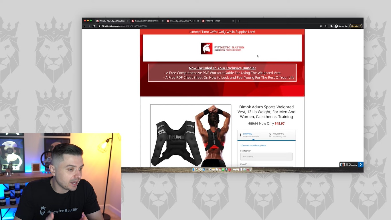
Screen grab of Peter Pru analyzing Fitnetic Nation's product offer

Looking at the products on Fitnetic Nation’s .org domain, we didn’t love the design of the product pages. The biggest problem was the absence of any kind of engaging offer. The price for the Dimok Sport Weighted Vest showed a sale lowering it from around $60 to $45.97. But there wasn’t anything attention-grabbing about the rest of the page. Also, the site didn’t prominently display the price. Even if people see the price drop, they may just head over to Amazon. They might find the product for even less there.

Whenever you sell a product through your business, you have to ask why anyone would buy your products. What is it that differentiates your brand from the many others out there? If you can provide a compelling answer to this question when launching your store, you’re that much closer to developing an exciting offer that drives sales.

An Unexpected Feature: The Music Tab

One unusual item that we noticed on the .org website was a tab in the main navigation labeled Music. When we opened that page, we unexpectedly found a single listenable track that we were able to load into iTunes. It essentially appeared to be a workout track that people could check out, which we thought was kind of cool.

In fact, we believe that could have been a great way for this brand to stand out. They can include a playlist of songs that inspire people to work out. What would make this a particularly effective selling point would be to include it for free with the purchase of other products. We let this count toward some points for Fitnetic Nation. But we think this would work better as a bundled product.

A Simple Mission Page That Needs Some Work

While it’s a good idea to include an “Our Mission” page, we found Fitnetic Nation’s to be empty and devoid of personality. The mission statement at the top of the page was simple and synonymous with many other fitness companies’ mission statements. And while the page mentions the company’s devotion to top-quality products and craftsmanship, there were no pictures or other accompanying text to establish the differentiating factor.

The Importance of Standing Out
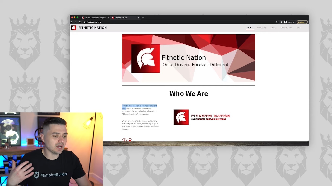
Screen grab of Peter Pru analyzing Fitnetic Nation's website

Overall, the most glaring issue we had with Fitnetic Nation’s .org and .com websites was the distinct lack of any kind of attempt to stand apart. With so many competitors in the fitness niche, showing what makes your products different is a key part of how to make money with ClickFunnels and Shopify. The few product images on the website were simple stock images that didn’t truly show products in action. Also, there were no customer testimonials to vouch for the site’s claims of providing products of exceptional quality.

Looking back at their .com ClickFunnels site, we did notice that Fitnetic Nation had included an offer at the top of the main page. The offer was strong (featuring two free PDFs that would come with an “exclusive bundle”). But it was below a banner image with a logo. To be more effective, the offer would benefit from being placed above the logo. Ultimately, the logo doesn’t even need to be in there, as businesses need to build themselves around logos. A logo doesn’t mean anything if the brand doesn’t have a reputation that people associate with that logo. 

Our Final Score: 4.1

Based on what Fitnetic Nation is doing with their site at the time of this review, we feel that a 4.1 is a fair rating for this store. Right off the bat, we liked the use of funnels. There was also the start of some good ideas, such as the mission statement and the music section. But there needs to be a lot more. There are plenty of winning starting ideas here, but they could benefit from some expansion.

While there’s an offer on the ClickFunnels site, it’s hurt by a logo that’s entirely unnecessary. It’s also important to highlight the true value of that offer. For those free PDFs, for example, Fitnetic Nation could list the prices that they would normally cost. Additionally, there needs to be a specific niche and target audience within the fitness niche. Selling to parents, professionals, or young aspiring athletes could lend a sense of identity to this brand and speak to a particular group. The overall design of the website could also benefit from a clearer identity and engaging visual themes.

Fitnetic Nation is off to a great start on how to make money with ClickFunnels. But there are many ways to improve this business and transform it into a seven-figure earner.

Consult With the Pros

Dropshipper learning more about how to make money with ClickFunnels

If you would like to submit your own store for review, feel free to send us your information today and get a personalized review that helps you learn how to make money with ClickFunnels. You can also learn more about how to make money with ClickFunnels and earn a full-time income with our free Ecommerce Empire Builders masterclass. To get started with your own store and harness the power of sales funnels, register for this free webinar today. You can also watch more of our Roast and Ranks series on my YouTube channel.

Tagged : / / / /

Roasts and Ranks: Develop Your Dropshipping Niche Like This $50k Sticker Store

In this episode of our series Roasts and Ranks, we’ll be reviewing an online sticker store to see what they’re doing right and what they could be doing better. This follows the same format as the rest of our series, which scores businesses on a scale of 1 to 10, from worst to best, based on how they perform in four different categories, including the dropshipping niche, offers, funnel, and traffic.

If you would like us to feature your business in our Roasts and Ranks series and gain access to the leaderboard, you can easily submit your funnel or store on our website. Regardless of how you perform, we’ll send you $100 to your PayPal if we review your business.

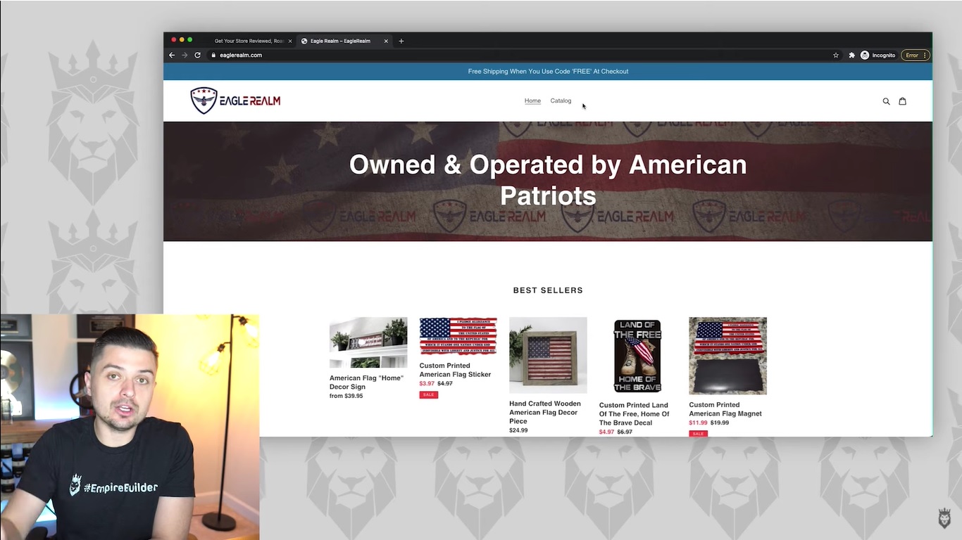
This particular store we looked at is a sticker store called Eagle Realm, which is run by one of our $50k Club students.

A Clearly Defined Dropshipping Niche

One of the most important things for any ecommerce store to have is a specific dropshipping niche that makes it clear what they’re about. Otherwise, people are likely to leave if they don’t connect with any particular dropshipping niche. Put simply, if you’re trying to appeal to everyone, you’ll ultimately be appealing to no one. Thankfully, Eagle Realm gets this right from the start with its target niche, which caters to a patriotic aesthetic that’s sure to attract a specific target market. 

The homepage has a header “Owned & Operated by American Patriots” over an American Flag banner. Combined with the list of flag-themed, best-selling products immediately below, we instantly know what Eagle Realm is all about. The site offers everything from American flag home decor to stickers, decals, and magnets sharing this consistent theme of national pride.

The Layout

Eagle Realm also sticks to a simple layout to avoid over-complicating anything, which is a good strategy. It prevents any confusion over navigation or too many steps. However, in addition to the basic “Home” and “Catalog” tabs at the top of the page, we’d recommend adding a “Contact Us” or “Track Your Order” page. 

To really express the value of this site, we’d also suggest creating something like an “Our Story” page. This could detail what inspired this site and its overall mission. Showing pictures of the first sales and how the site got started could add a personable “behind the scenes” touch that people love to see.

Oftentimes, people may not buy directly from the main website. They might instead use it to contact the store owner. That’s why we definitely feel that this store could benefit from adding a contact page of some kind with a tab in the top navigation.

When it comes to the dropshipping niche itself, Eagle Realm very clearly earns a 10. The business knows its target audience.

A Strong Offer That Emphasizes Value

Screen grab of Peter Pru reviewing Eagle Realm's store

Generally, we felt that the business has a strong offer. The bestsellers listed at the top clearly showed some of the unique designs offered at Eagle Realm. In addition, the prices for these offers were low and likely to attract eager buyers. One small change we would recommend is making all the bestseller images the same size. This will lend some added credibility. 

Another strong element that we liked was the “Proceeds Donated to Veterans” header below the initial offers. The section highlights the values behind the website. It lets visitors know that a portion of the proceeds will go to veterans in need. That message is very likely to resonate with the target audiences and encourage them to make a purchase based on those shared values.

Below that section detailing donations is a list of more best-selling products. These are the same ones featured in the first list. Another note about the images we had was that we would like to see a little more congruency with the images. As they are, they’re a bit too varied. Some images feature plants in the background, while others have a plain white background. Having the same format for all images could make things feel slightly more consistent.

To further complement the offer is a section featuring customer reviews. We believe it could benefit from even more reviews with pictures of the products in use. It’s easy to attract more reviews from customers by sending an email blast offering them incentives for leaving a review, such as discount codes toward their next order.

Overall, Eagle Realm features a rich homepage with great offers that could use a few improvements here and there.

Product Pages That Could Use Some Added Value Points

Screen grab of Peter Pru recommending changes to product pages

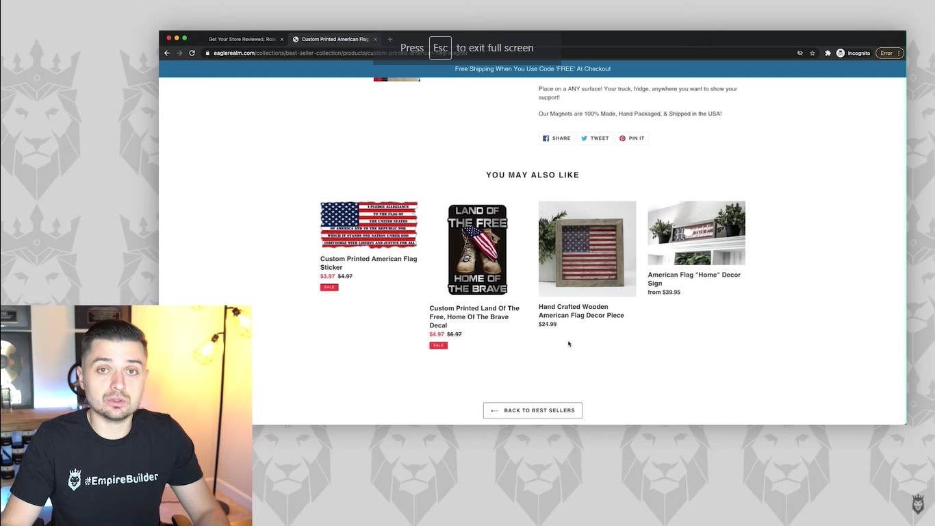
When looking at a specific product page for Eagle Realm’s Custom Printed American Flag Magnet, we were impressed by the overall presentation of the product. Several logical points were touched on in the product description. These include the size, materials, and other basic information that customers would likely want to know. They also had multiple lifestyle photos showing the magnet used on a fridge, placed on a truck, and by itself. This helps customers get a feel for how it would look during use.

However, we noticed a lack of customer reviews, which is vital when pushing individual products. The page was also devoid of any information about Eagle Realm’s mission or mention of proceeds. They could easily fix this by including an image similar to the banner on the homepage. This new banner could detail how proceeds would go toward veterans. Eagle Realm could have this image on all product pages and throughout the sales funnel to emphasize the company’s values.

Our Overall Rating: 7.9

There’s a lot to like about Eagle Realm, as they have a clear dropshipping niche and a clear mission that helps push the offer. But there are certain aspects that could definitely benefit from some improvements. We recommend making the mention of donations ubiquitous across all product pages. Also, they should create a separate story page to detail the company’s values and beginnings. Other changes include getting more customer reviews with visuals and adding even more direct offers to drive more sales.

Consult With the Experts

Feel free to submit your store to us if you want to find out what we have to say about your store’s performance. This could help you figure out what to optimize for improved traffic, engagement, and overall sales. To learn even more about how to develop a winning dropshipping store and thrive online, register for our free Ecommerce Masterclass today. You can also visit my YouTube channel for more ecommerce and dropshipping insights.

Tagged : / / / /

Our Roasts & Ranks Review of a Clothing Dropshipping Store

So, you’ve set up your clothing dropshipping store. You added a host of fantastic products, but sales aren’t coming. If you are an optimist, you’ll probably soldier on thinking Rome wasn’t built in a day and hoping your fortunes will turn on account of the excellent products you have on offer. But if you are a pessimist, you may question the dropshipping model’s legitimacy. If you fall in either of the two categories, you’re likely not to succeed. 

Let’s debunk the pessimistic theory. The dropshipping industry’s market value stood at around $ 102.2 billion in 2018. Additionally, in the period from 2019 to 2025, it is projected to grow at a compound annual growth rate of 28.8%. There is a big market for dropshipping products. However, regardless of how positive you are, your store will not perform well unless you implement the right strategies. This is why it is crucial to learn from successful dropshippers. At Ecommerce Empire Builders, we help our subscribers scale their dropshipping businesses by reviewing, critiquing, and offering advice. In this episode of our Roasts & Ranks series, we’re reviewing NK Streetwear, a clothing dropshipping store. To provide you with actionable insight, the store will be reviewed based on the following categories:

  • First impressions
  • Whether it’s niche-specific
  • Value of the offer

1. First Impressions

Dropshipping as a business is only possible thanks to increasing digitization. However, this is also its primary challenge. There are social media platforms, websites, and other online entertainment platforms. There are also other dropshipping stores competing for the same audience, so internet users are spoilt for choice. As such, it is integral that you capture their attention immediately when they visit your page. 

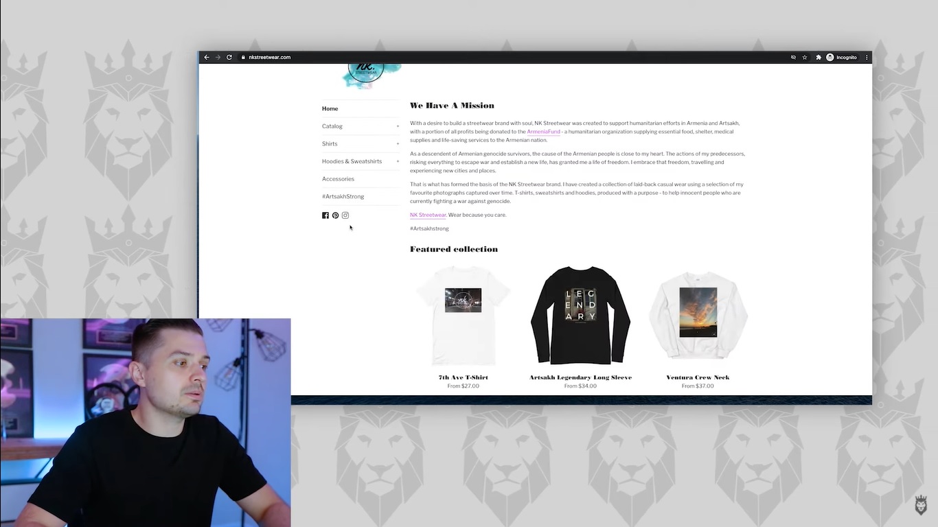
Peter Pru examining the landing page for NK Streetwear

The first impression is vital for a clothing dropshipping store (or any other store). With the case of NK Streetwear, the first impression is not ideal. As soon as the page loads, you’ll be met with lots of text. Having a message for your customers is good. But a wall of text should not be the first thing they see. 

A general rule of thumb is to highlight products immediately. In this case, customers should see the best attire on offer by NK Streetwear at first glance. When displaying the products, it’s best to take a consumer-centered approach rather than focusing on the product alone. This means, instead of posting products on blank white backgrounds, you should use pictures of people actually using the product. For NK Streetwear, this should be people wearing hoodies and t-shirts. 

Pro Tip:

If your budget allows, use an influencer to create traction for your collection and brand in general. 

2. Niche Specificity

As empire builders, it’s easy to get distracted with all the possible products you can add to your store. While each product may be individually good, focus on niching down as much as possible. Instead of being a clothing brand dealing with all manners of attire, find a specific niche to target. With this, you will realize far better results. 

As for NK Streetwear, the brand performs exceptionally well in this category. Their main focus is selling clothing with images of different cities in the world. Along with being a very specific niche, it is also quite unique, making it even better. 

Another pitfall you should avoid is adding too many products. Whereas this may create the impression you are doing more, it does not necessarily translate to more sales. Create a small selection of exceptional products and turn your attention to marketing. After all, your objective is generating sales.

3. Value of the Offer

shopper deciding to buy products from a clothing dropshipping store

In most cases, your customers’ purchases are not influenced by necessity but rather by impulse. For them to take out their credit cards and actually make a purchase, you must offer something that they value. In this regard, you can target something that solves a specific problem or capitalizes on their interests. This should then be accompanied by good quality and fair prices.

The designs on NK Streetwear attire are undoubtedly good. They have the potential to appeal to residents of their target areas and travel enthusiasts. However, despite the fair prices charged, the clothing and materials could be better. A key element of succeeding in dropshipping is getting shoppers to come back for more products. This can only be achieved if their first purchase meets their expectations.

Another element of the value offered by NK Streetwear is its mission. Along with creating a streetwear brand with soul, a portion of their profits is channeled towards humanitarian efforts in Armenia and Artsakh. This is a great mission that undoubtedly adds to the value of their products.

Standing for such a cause adds value to your products. However, your mission should not be your primary selling point. The mission should not catalyze the purchase — it should validate it. After purchasing, customers will feel good that they have helped in some way.

Rating of This Clothing Dropshipping Store: 3.9

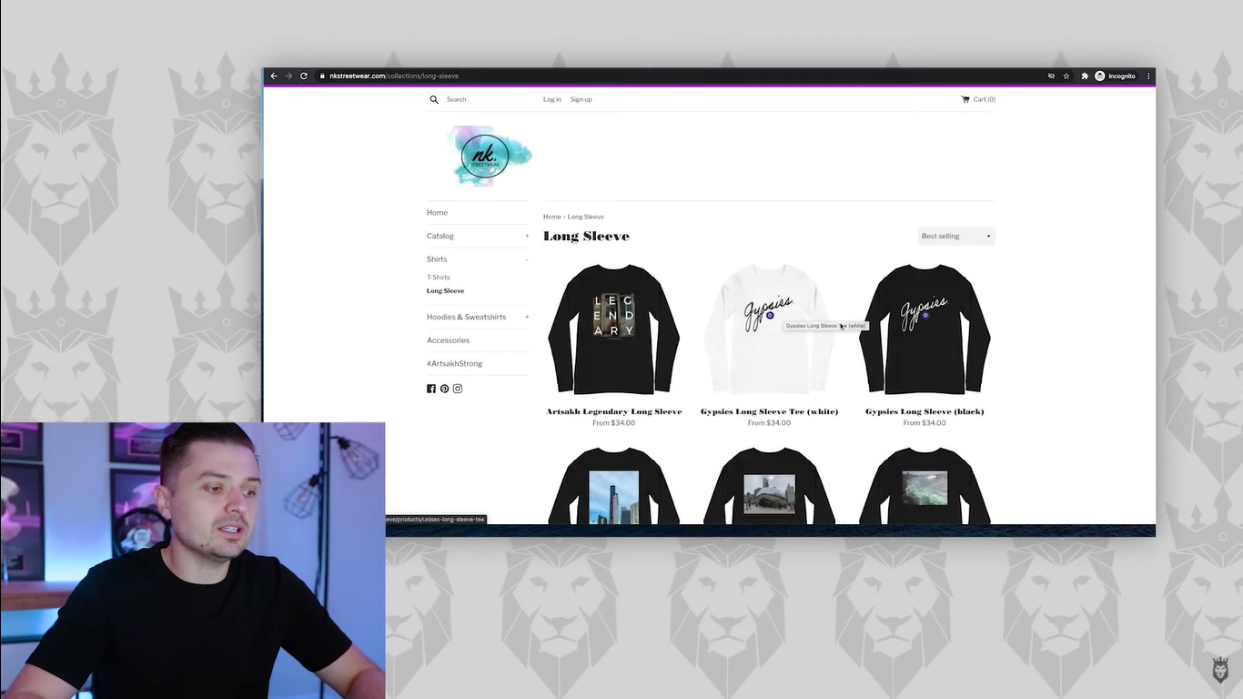
Peter Pru discussing products on NK Streetwear, a clothing dropshipping store

NK Streetwear undoubtedly has a great value proposition, which makes the 3.9 rating seem a bit harsh. However, in your quest to build your dropshipping empire, remember that you need a lot more than good products to sell. Based on my first impression of their store, visitors will have no idea of the products that are on offer. This means a significant number will quickly hit the back button on their browser.

For those who make it to the product catalog, the images do not showcase the clothes in use. Also, there is a big question mark on the quality of the garments. Though the prices are fair, not many people are keen on buying clothes that will lose elements of their quality after one wash.

Get Your Store to the Next Level

Rome was not built in a day. But it did not take a lifetime, either. For your store to begin generating sales consistently, you need to implement the right strategies. One key aspect of this is setting up a sales funnel. At Ecommerce Empire Builders, we are committed to helping you scale your dropshipping business. Send us an email to get your store reviewed, and sign up for a free webinar to learn how to scale your business. You can also subscribe to my YouTube channel for fresh insights and strategies.

Tagged : / / / /

Our Roasts & Ranks Review of a Potential 7-Figure Dropshipping Store

So many people request reviews from us for their dropshipping stores. So we decided to officially start our Roasts & Ranks series to do just that. In addition to reviewing dropshipping stores, we’re also using this series to rank them based on their performance.

Do you want to submit your own store and feature in our Roasts & Ranks series? You can do so by sending an email with the subject line “Roasts & Ranks Store” to Peter Pru at [email protected]. You’ll have the chance to make it into this series with a thorough review. On top of a review that explores what you’re doing right and what could benefit from improvement, you’ll also get $100 sent to your PayPal account if we choose to review and rank your store, regardless of performance.

How Roasts & Ranks Works

For each Roasts & Ranks review, we’ll be looking at four main categories to gauge how well a store is doing:

  1. First Impressions — How people will react upon first encountering the business
  2. The Niche — The types of products and categories the store sells
  3. The Offer — What differentiates the store from others and value to consumers
  4. The Funnel/Store — How the store collects assets and drives sales

Based on each store’s performance in these four categories, we’ll be giving an overall score from one to ten, with ten being the best.

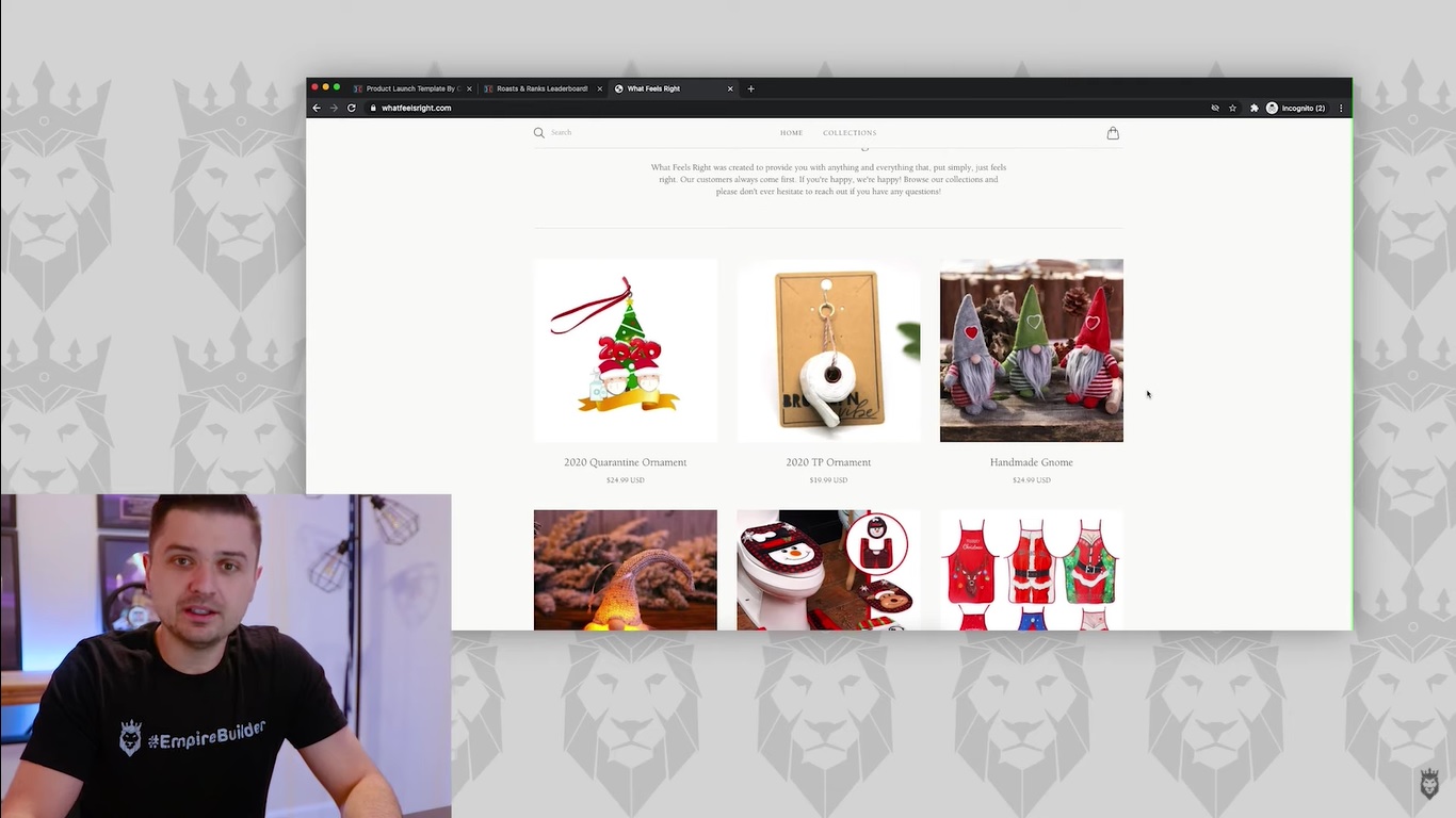
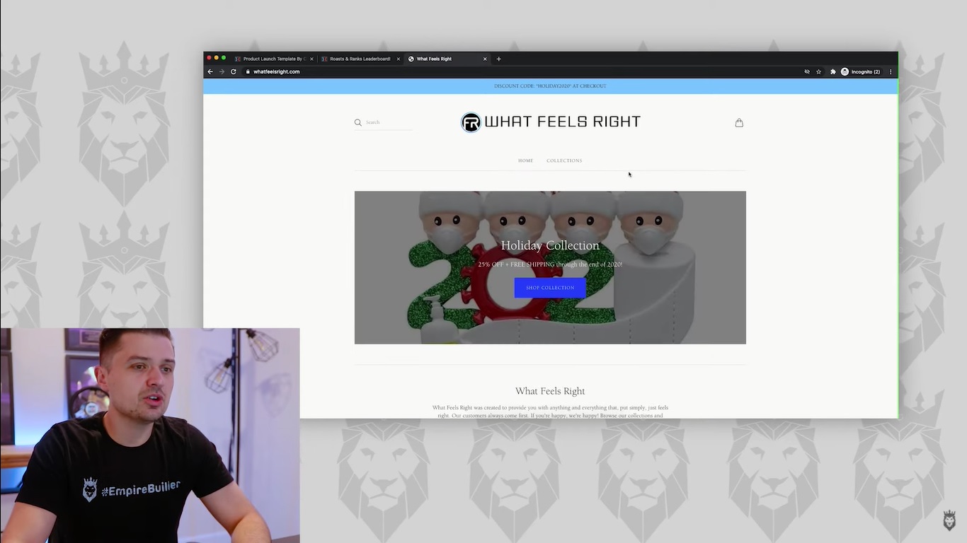
The first store we’re going to be looking at here in the Roasts & Ranks series is What Feels Right, at whatfeelsright.com.

First Impressions From What Feels Right

After visiting their website for the first time, we didn’t feel that it left a good first impression. The biggest issue we had with the site was that it seemed too broad in its product scope. While certain items had a Christmas vibe to them for the holidays, such as Christmas decorations and tree ornaments, there were categories such as “Pet Collection” and “Household Collection” below that made the core category a bit too unclear.

In short, we felt that this website gave off the vibe of a generic Shopify store with nothing that really made it stand out. We believe that this store could have given a better first impression if it had a specific focus. For example, it could’ve featured a holiday-themed background and highlighted holiday-themed items toward the top of the homepage that would have spoken to a specific audience. As it stood at the time of this review, the store seemed too general and unfocused to appeal to a specific type of shopper.

We Couldn’t Nail Down a Specific Niche

The main reason behind our negative first impression was the lack of a specific, focused niche that we could identify. The site seemed all over the place in terms of inventory. It had a mix of Christmas-themed products and ornaments with the seemingly random pets and household categories below. There just didn’t appear to be a coherent structure to the store. Instead, it offered a random selection in an attempt to appeal to anyone.

We definitely felt that this store needed to stick with a particular niche. This could have worked well with the Christmas theme. For instance, they could have sold a humorous 2020 Quarantine Ornament, which was a 2020-themed ornament that referenced the pandemic featuring two characters with masks and a bottle of hand sanitizer in front of a Christmas tree. It could make for a light, funny novelty gift that could be one of their bestsellers. In addition, people could personalize it to make it their own when buying it, which added even more appeal.

Instead of a singular focus, the site opts for creating a section around Christmas ornaments. It also had subcategories that feature a variety of unrelated products ranging from pet feeders and pet hair removers to towel holders and night light projectors. It has the overall vibe of a site that’s throwing everything at the wall to see what sticks. This prevents it from having any clear identity.

An Offer That’s Equally Unclear

Screen grab of Peter Pru discussing the importance of images on a site

When it comes to the value that What Feels Right offers, that was also too vague. Sure, the 2020 Quarantine Ornament is a fun-looking product. It also had a multitude of customer reviews with high star ratings and positive comments. Still, we saw no images of the product in use. There was also a lack of images in the store itself featuring the item in use. We didn’t see photos of it hanging on a Christmas tree to show its size and how it looks in a real-world setting. 

We always recommend that people show their products being used to demonstrate how they look and function once purchased. It’s an integral feature of a winning offer that further confirms the value the product brings. Otherwise, people are going on empty text reviews and blind faith that the product will be as good as the seller claims it is.

We were impressed with some of the specific products sold on What Feels Right. But there were ways we felt they could build on them with a richer ecommerce experience.

A Store That Feels Generally Incomplete

Screen grab of Peter Pru discussing how a lack of contact informations hurts credibility

There’s a good chance What Feels Right sold a good number of Christmas ornaments and other similarly-themed products during Q4. However, we’re always wary about focusing on seasonal products, particularly when that’s the store’s primary focus. There are plenty of other products in the store that aren’t seasonal. But they’re too random to categorize collectively and focus on.

Another issue we had with the store as a whole was its lack of navigation and overall features. We didn’t see a link in the top navigation to any kind of contact page or specific categories. We also saw no guarantees on the homepage or much else to get people engaged beyond a couple of social media links in the footer. 

The website reflected a common issue we’ve noticed with many ecommerce sites. They spend too much time and effort on adding and pushing new products. The governing attitude here is that they’re one product away from a breakthrough. But the fact is that they’re one niche away. It’s not about maximizing the number of products in your inventory to connect with everyone. It’s almost exclusively about focusing on one core niche that builds a loyal following of customers within a specific audience. 

There was also a distinct lack of a sales funnel on What Feels Right. Although many ecommerce business owners don’t think they have a sales funnel, the fact is that they do have one. But it’s not always efficient or developed. They rely on products to sell themselves with simple product pages. Also, there’s just a basic shopping cart that leads people to a sale.

Our Overall Rating: 4.2/10

We feel that — with What Feels Right’s current platform at the time of this review — the store deserves a 4.2 rating from Roasts & Ranks. We saw that there was a degree of effort invested in putting this store together. It had plenty of potential to become a winning ecommerce business. At the same time, there was a lack of focus regarding products and niches. Also, the structure of the site seemed lacking and undeveloped. The website also lacked an effective sales funnel, which could go a long way in driving sales and optimizing the buying process. Again, with more focus on a specific niche such as holiday-themed products and a more developed store overall, this site has the chance to thrive.

Consult With the Experts

Happy dropshipper improving her business site

If you want to find out more about how you can build a successful ecommerce business with a highly developed website and efficient sales funnels, reserve your seat at our free ecommerce masterclass. You can also find more insights and Roasts & Ranks reviews of ecommerce sites on my YouTube channel.

Tagged : / / / /